
uniapp实现单选组件覆盖选中样式的方法
uniapp实现单选组件覆盖选中样式
完整代码:
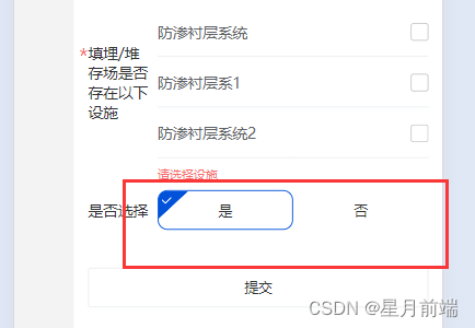
<!-- 是否选择组件: trueOfFalseChooseBtn -->
<template>
	<view class="is-true-body">
		<view class="btn-con" :class="isTrue ? 'btn-con-active' : ''" @click="clickBtn(true)">
			<text>是</text>
		</view>
		<view class="btn-con" :class="isTrue ? '' : 'btn-con-active'" @click="clickBtn(false)">
			<text>否</text>
		</view>
	</view>
</template>
<script>
	export default {
		props: {
			value: {
				type: Boolean,
				default: true,
			},
		},
		watch: {
			isTrue(nv) {
				this.$emit('input', nv)
			}
		},
		data() {
			return {
				isTrue: this.value,
			}
		},
		methods: {
			clickBtn(e) {
				this.isTrue = e;
			}
		}
	}
</script>
<style lang="scss" scoped>
	.is-true-body {
		width: 100%;
		display: flex;
		justify-content: space-between;
		.btn-con {
			flex: 1;
			height: 40px;
			border-radius: 10px;
			text-align: center;
			line-height: 40px;
			position: relative;
			border: 1px solid rgba(255, 255, 255, 0);
		}
		.btn-con-active {
			border: 1px solid $uni-color-primary;
		}
		// 左上角三角形
		.btn-con-active::after {
			content: '';
			position: absolute;
			top: 0;
			left: 0;
			width: 0;
			height: 0;
			border-top: 28px solid $uni-color-primary;
			border-right: 30px solid rgba(255, 255, 255, 1);
			border-radius: 8px 0 0 0;
		}
		// 左上角勾勾图片
		.btn-con-active::before {
			content: url('@/static/images/icon/gg.svg');
			position: absolute;
			top: -12px;
			left: 3px;
			width: 10px;
			height: 10px;
			z-index: 999;
		}
	}
</style>
补充:
修改uniapp组件默认样式
最近使用uniapp开发,有些组件渲染之后会生成一些标签,需要修改生成标签的样式。比如
<uni-data-picker > 等组件,自定义类名还是加重权限均无法覆盖原有样式,解决办法如下:
style标签上加scoped,同时类名前加/deep/ 穿透,即可覆盖原有样式
/deep/ .input-value-border{
    border: none;
}
到此这篇关于uniapp实现单选组件覆盖选中样式的文章就介绍到这了,更多相关uniapp内容请搜索代码部落以前的文章或继续浏览下面的相关文章希望大家以后多多支持代码部落!
本文章来源于网络,作者是:星月前端,由代码部落进行采编,如涉及侵权请联系删除!转载请注明出处:https://daimabuluo.cc/JavaScript/2308.html
